VoxMail
A project focused on creating an intuitive voice-messaging tool for websites, designed to enhance user interaction and accessibility.
UI/UX Design by: Susanne Duswald
Visit VoxMail WebsiteThe Full Experience
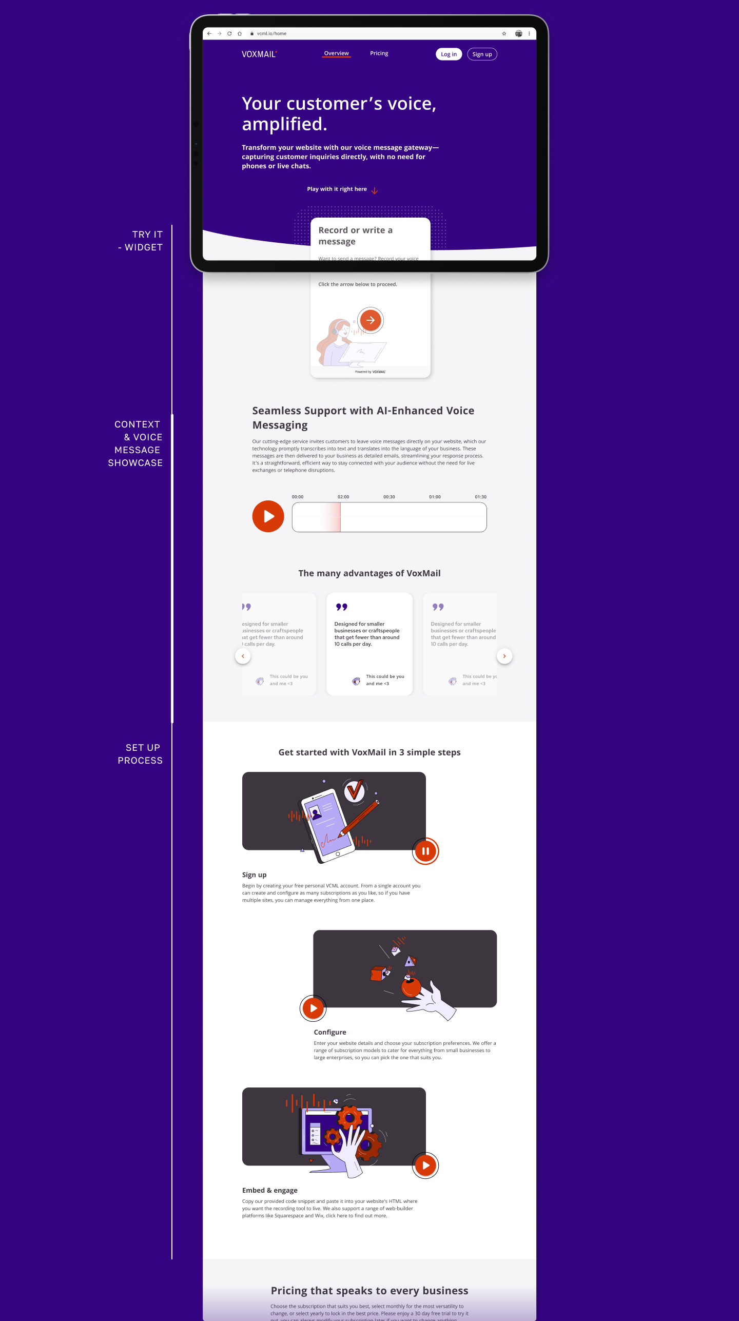
Full website render showcasing the design on an iPad Pro.
Initial Sketches
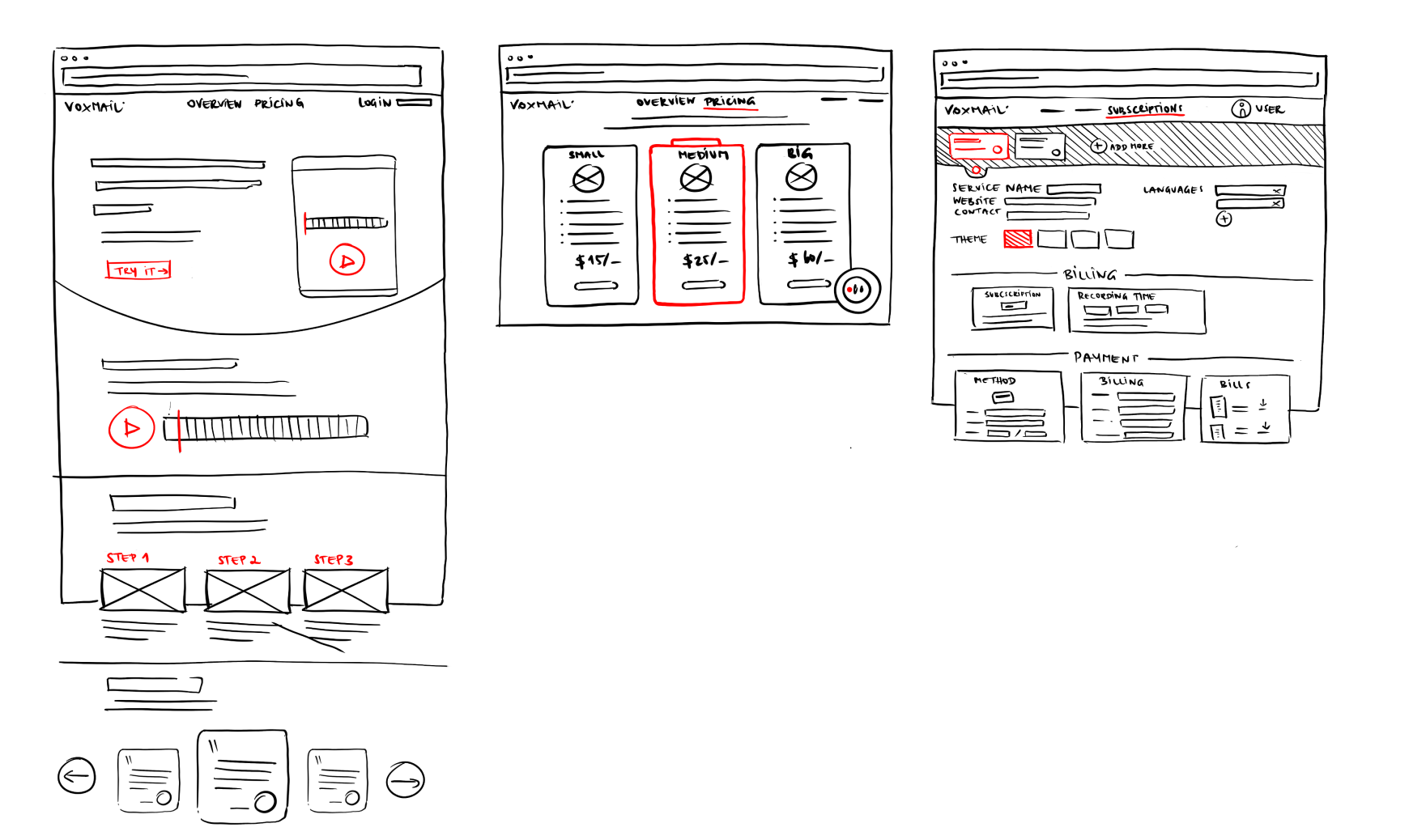
Early-stage brainstorming and layout exploration through hand-drawn sketches, forming the foundation for the user interface and experience design before moving into digital wireframes.
Branding Guidelines
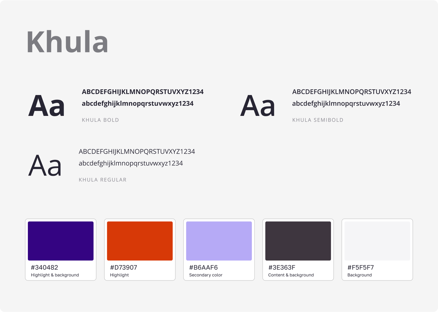
Defining the visual identity of VoxMail, including the primary color palette and typography choices used throughout the website and the widget tool to ensure brand consistency.
Wireframing
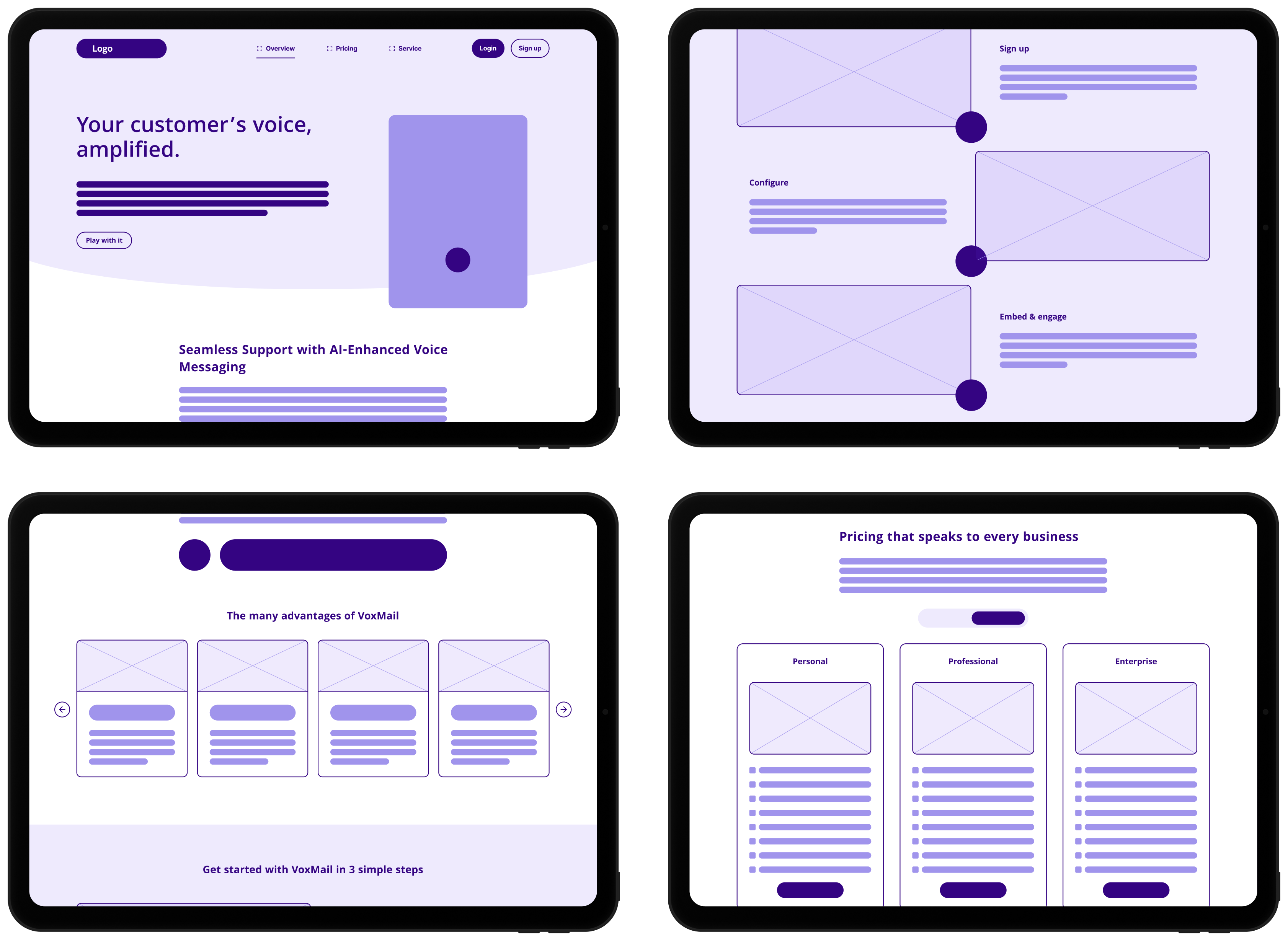
A collage showcasing the high-fidelity wireframes developed in Figma. This stage focused on structuring the website layout, content placement, and user flow prior to final design implementation.
Widget Design
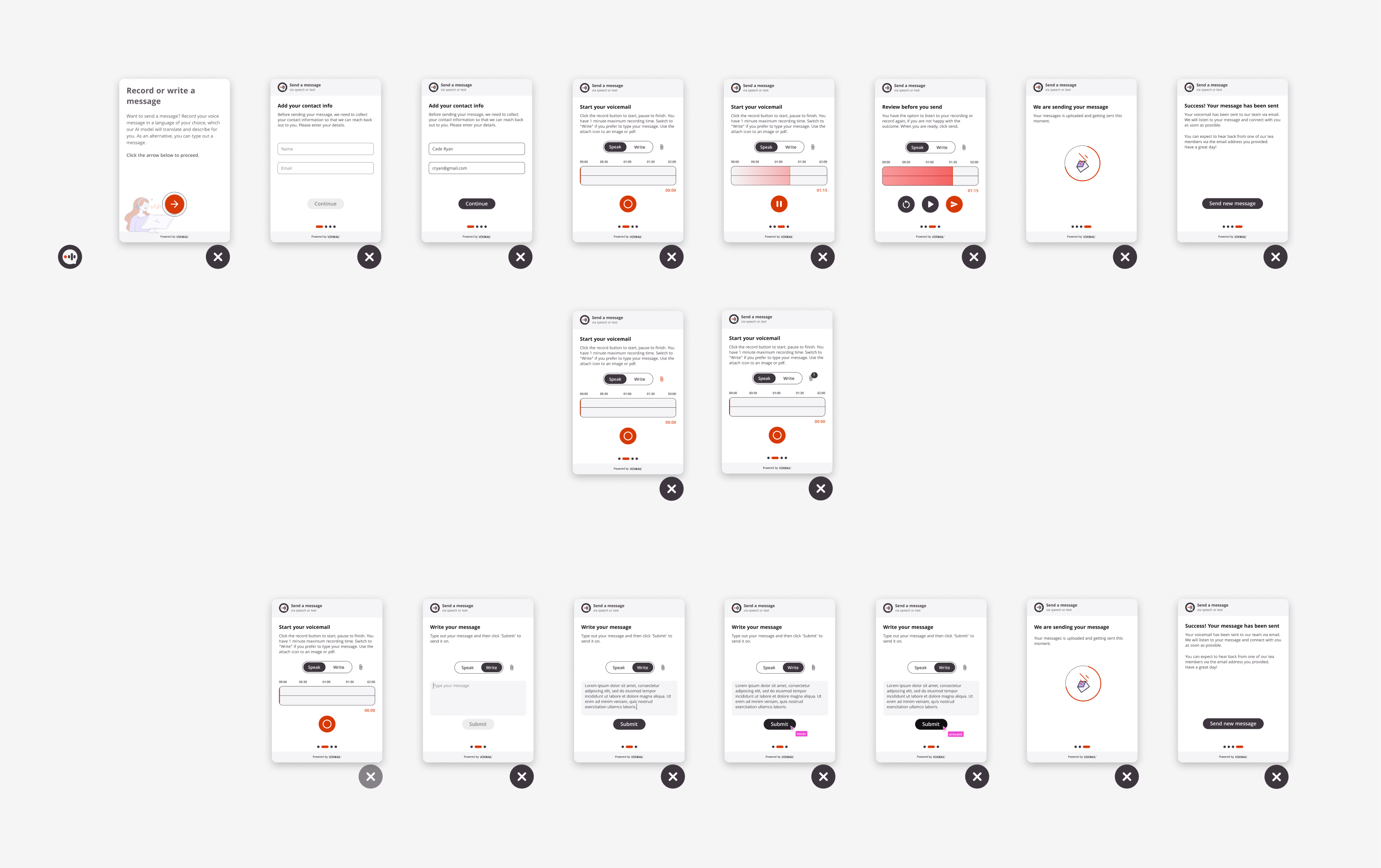
Figma renders presenting the various screens and states of the core VoxMail widget. This collage illustrates the final look and feel of the tool as it appears on client websites.
Widget Interaction Flow
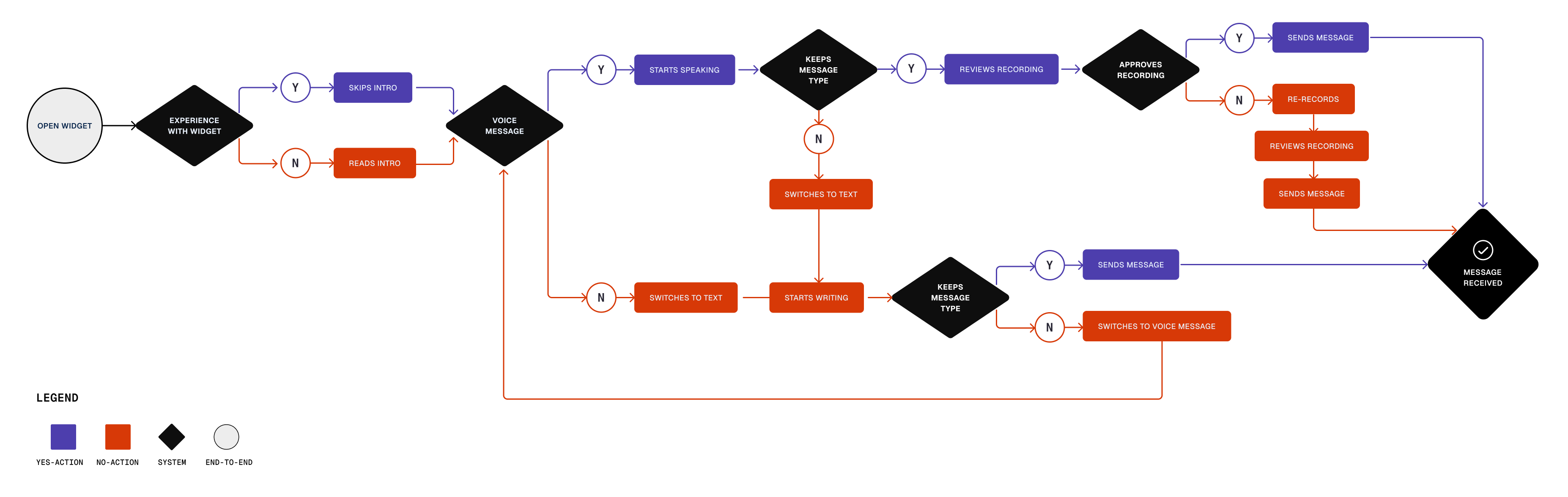
A flowchart mapping out the different user paths, logic, and interactions within the VoxMail widget, ensuring a smooth and intuitive experience for end-users leaving voice messages.
Accessibility Testing
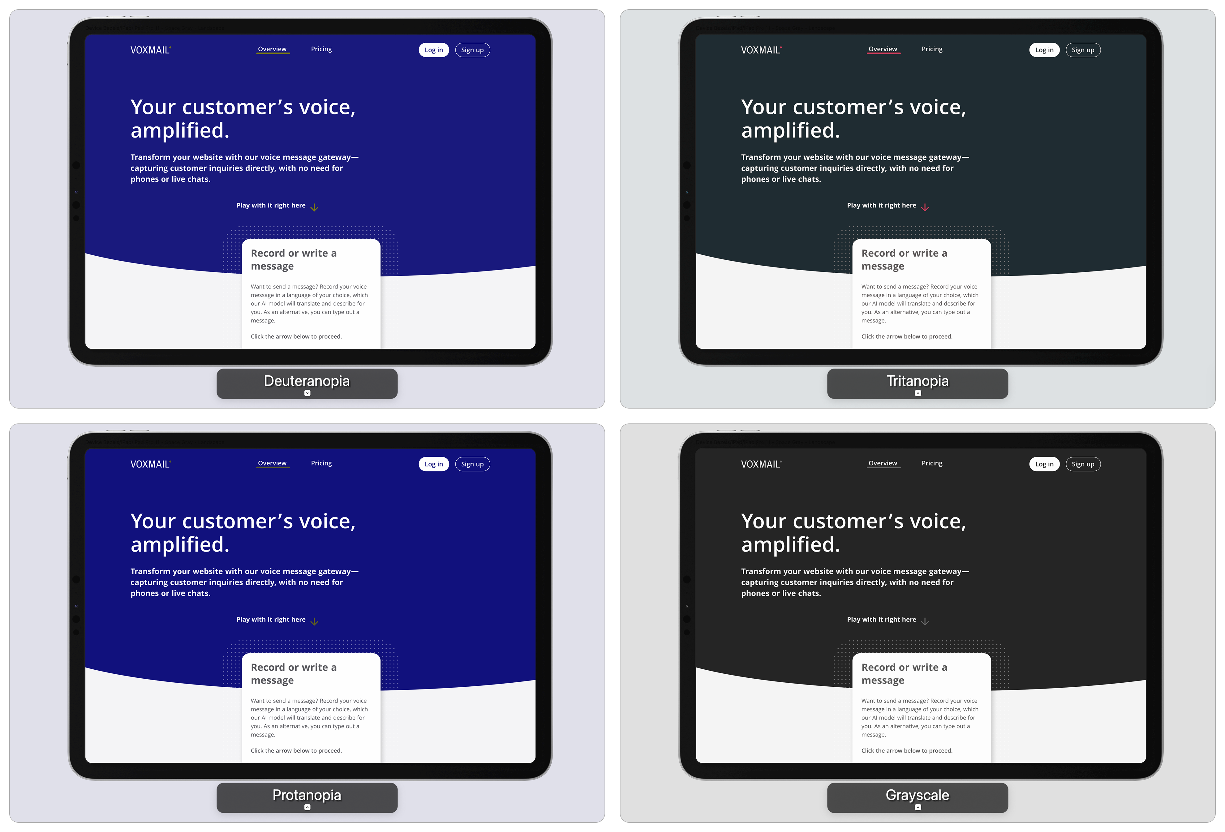
Demonstrating commitment to accessibility, this image shows how the chosen color palette and contrasts were tested against various forms of visual impairment, including Deuteranopia, Tritanopia, and Protanopia.
Multi-Device Responsiveness
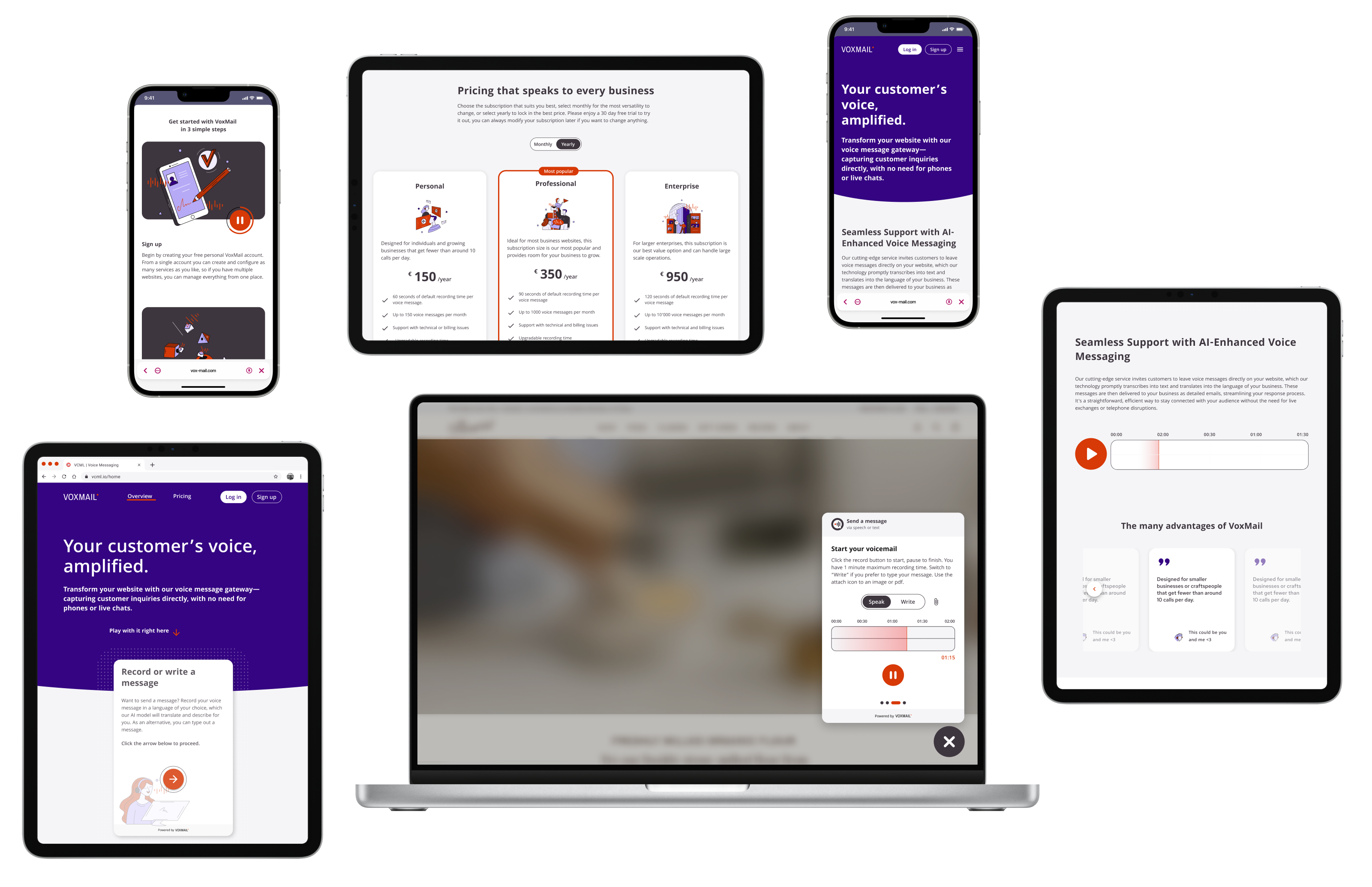
A collage rendering the VoxMail website and widget across multiple devices (desktop, tablet, mobile), highlighting the responsive design approach ensuring functionality and optimal viewing on different screen sizes.